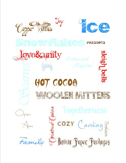
The top project was done in MS Publisher. I officially hate that program because the fonts are too picky, you can't type in the size you want, and you can't layer them. This program was just too dang fussy for my taste.
This is the same type of project but done in Photoshop. This one obviously looks better because Photoshop doesn't hate me. (Also i think I improved quite a bit on the color shceme. Christa says some of them are hard to read but as long it's astheically pleasing i don't really care.) Anyway, this project just proves that Photoshop is far better than many other programs, including Publisher.


No comments:
Post a Comment